

Reimagining Vehicle Software Visualization
Designing an intuitive visualization system for complex software dependencies.

About TechDex
About TechDex
TechDex is an initiative to help engineers tackle the growing complexity of vehicle software systems. It visualizes interconnected software relationships, centralizes scattered data, and enables quick assessment of compatibility for new features and updates.
My Role
My Role
As the product designer, I led research, ideation, prototyping, and gathered stakeholder feedback, collaborating closely with the product lead to iterate on the solution.
The Challenge
The Challenge
Design a solution that enables users to visualize software compatibilities and understand developmental status. The design should align with users' mental models and allow quick access to relevant information.
TLDR;
Picture this: Automotive engineers juggling multiple platforms, constantly having to context switch, just to figure out if (and how) their software works together. Sounds terrible, right? That's where I came in. After many sessions of research, analysis, feedback, and iterations, I took the chaos and translated it into a design that will help teams easily work with and quickly understand software relationships and compatibility.
Over 6 weeks, I took user pain points, stakeholder feedback, and business goals from concepts to user testing-ready designs of our new software compatibility system.
Why was this important?
Currently, engineers spend hours hopping between platforms just to figure out if software components work together. It's like trying to solve a puzzle while the pieces are scattered across different rooms – frustrating and wildly inefficient. Sometimes we're even reverse-engineering entire trucks just to understand how everything fits together. The impact? Delayed features, poor customer experience, missed innovation opportunities, and a constant stream of "this might break that" anxiety.
In order to empower our engineers to focus on innovation and creating amazing vehicle features, we needed to create a one-stop shop to understanding software compatibility.
Constraints & considerations
Limited Resources & Timeline
With an upcoming MVP launch, development resources and time were limited. We needed to focus on high-impact solutions that could be implemented and understood quickly without reinventing the wheel.
Complex User Landscape
With users spread across different teams and roles, each with varying needs and workflows, we needed to design a system that could serve everyone without overwhelming anyone. Limited access to end users meant we had to be strategic about gathering design feedback and particular about feedback insights.
Early UX Maturity
As UX research isn’t yet part of our team's standard process, I proactively sought out users and created lightweight testing methods to ensure our design decisions were backed by real user feedback, while demonstrating the value of user-centered design to the team.
defining our Problem
The Challenge: How might we help engineers visualize and understand software relationships quickly and confidently, while maintaining access to the technical depth they need?
I conducted 5 stakeholder interviews across different relevant roles to understand current workflows and pain points. The insights revealed three key areas of friction:
Research Insights
I conducted 5 stakeholder interviews across different relevant roles to understand pain points and current workflows to inform our design direction.
Insight
🧠 Existing Mental Models
Engineers already visualize software relationships in their heads – design should leverage these familiar patterns rather than create new ones.
📸 Need for Big Picture & Detailed View
Difficulty understanding how components fit together and sharing this understanding across teams slows down decision-making.
ℹ️ Varied Information Needs
Different teams need different views of the same data – design must support multiple ways to access and understand information.
Design Impact
→ Leverage Familiarity
Visualization system needs to maintain familiar hierarchical structures while introducing new relationship views.
→ Avoid Information Overload
Users need both quick overviews and detailed specifications – design should reveal complexity gradually to prevent overwhelm.
→ Role-based Personalization
Different teams need different views of the same data – design must support multiple ways to access and understand information.
Finding Visual Solutions That Work
After extensive research into visualization patterns and technical requirements, I converged on 2 potential approaches that balanced implementation effort with user needs.
- Focus on one single software hierarchy
- More closely matches current engineers' mental models
- Quick understanding of direct relationships
Option #1: Hierarchical Relationship View
- Focus on one single software hierarchy
- More closely matches current mental models
- Quick understanding of direct relationships
Option #1: Hierarchical Relationship View
Option #2: Network Visualization Approach
- Shows complete relationship context
- Better for system-wide understanding
- Reveals indirect relationships
- Shows complete relationship context
- Better for system-wide understanding
- Reveals indirect relationships
Option #2: Network Visualization Approach
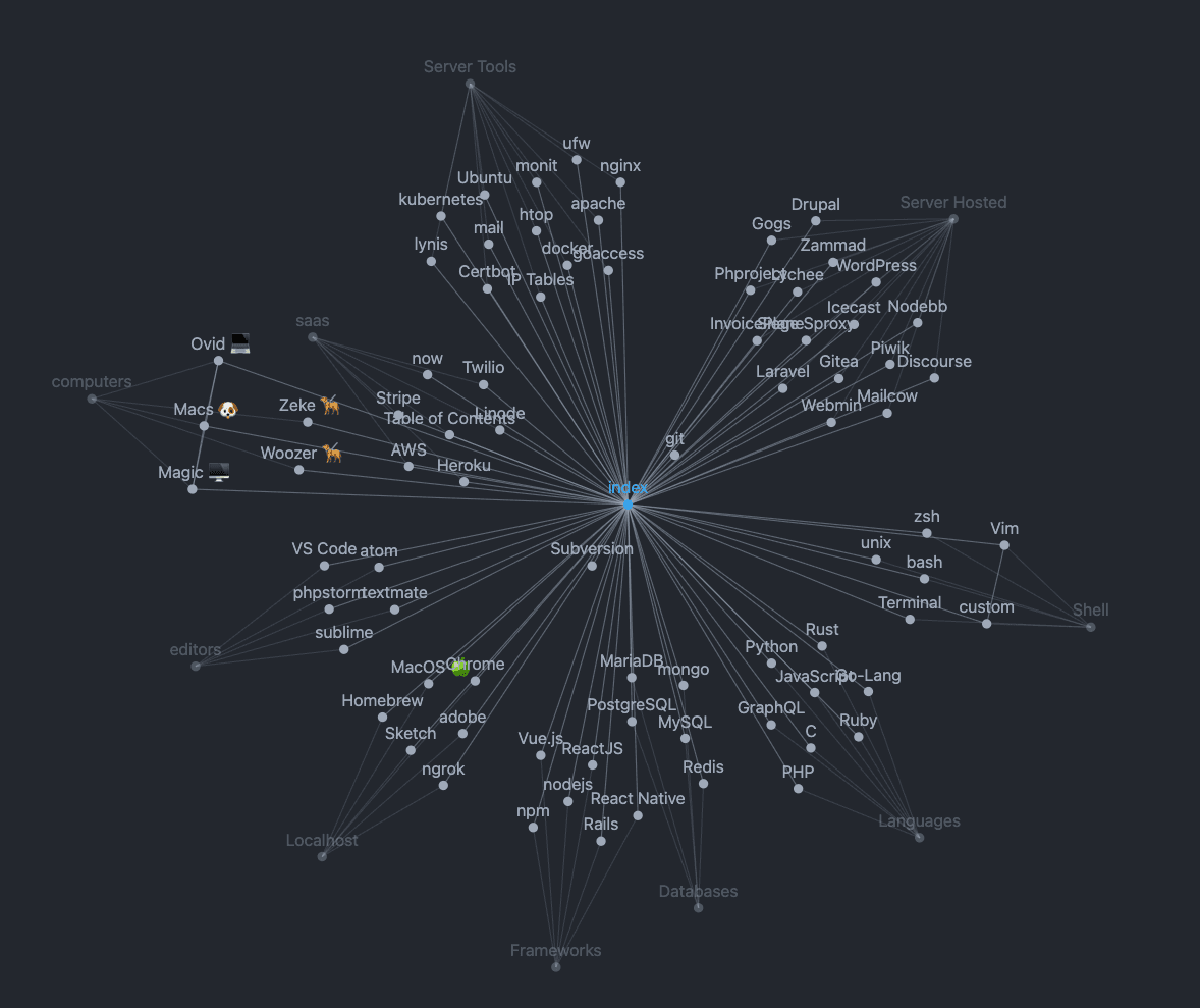
While the hierarchical view aligned closer to users' existing mental models, it oversimplified relationships and critically missed version control needs. The network view effectively showed the complete system context but risked overwhelming users with its complexity.
Navigating Connections Easily
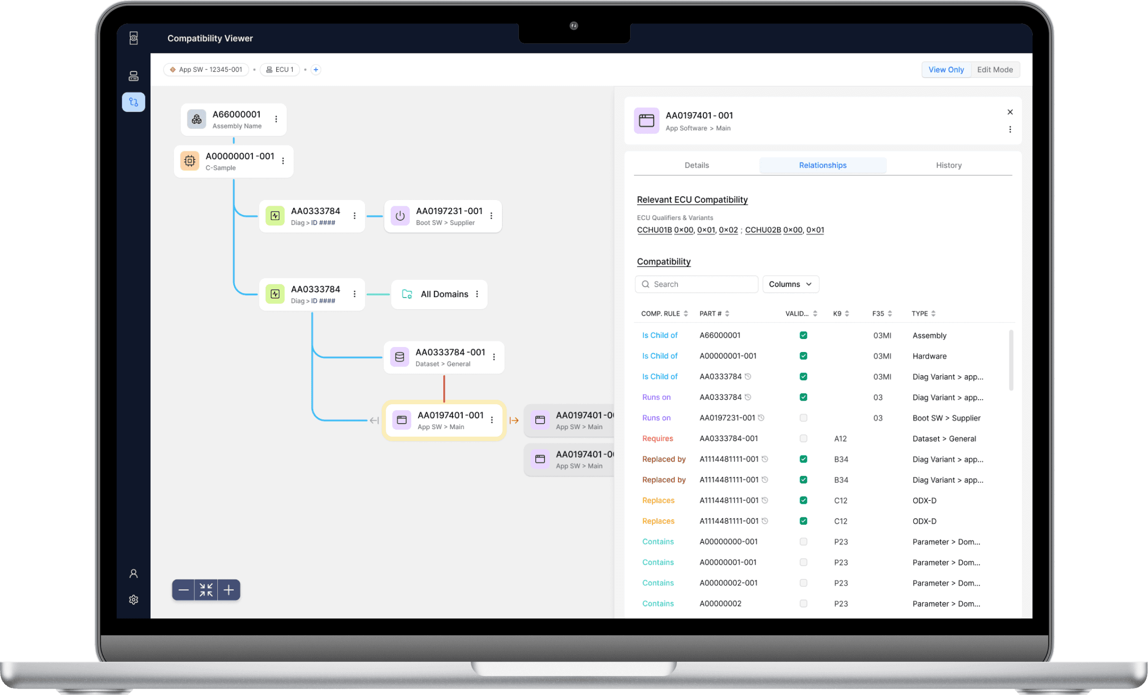
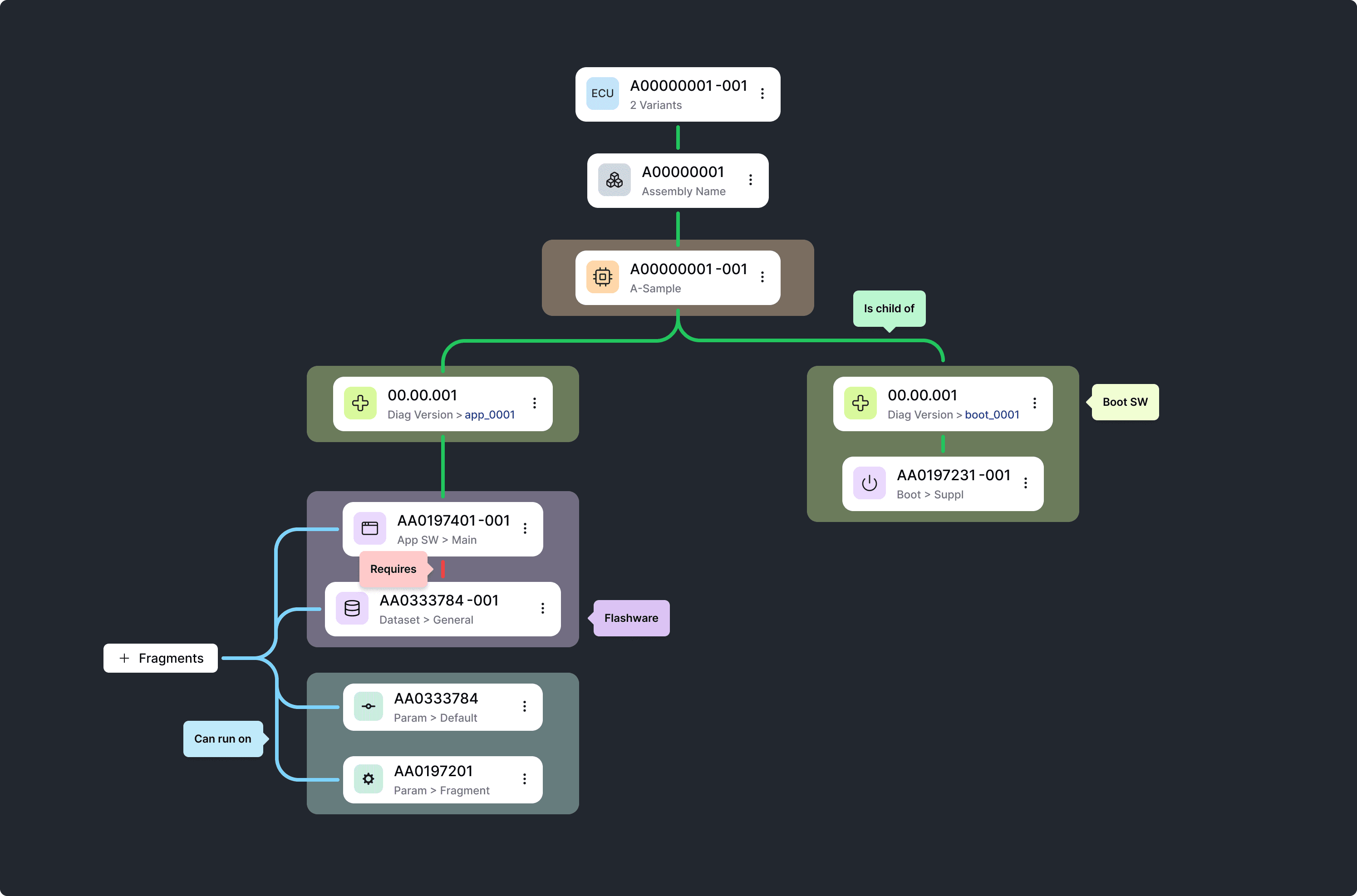
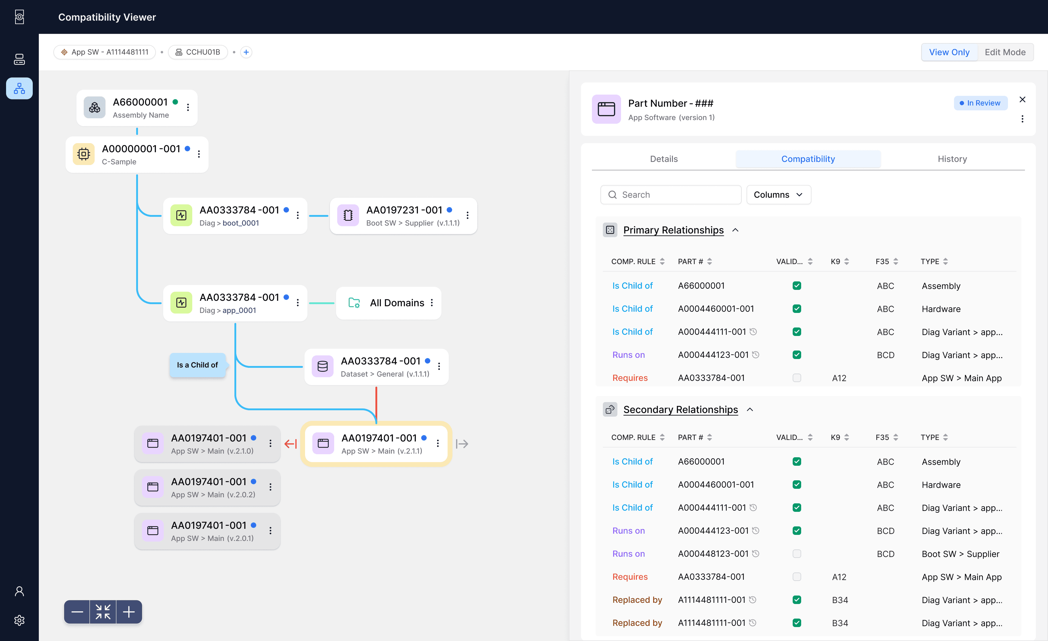
Our solution uses a simple hierarchy where you can pick what matters most to you. See connections to older versions by expanding archived relationships, or explore related items by selecting different focal points. This clean navigation lets you move easily between components and discover connections without getting lost in technical details.
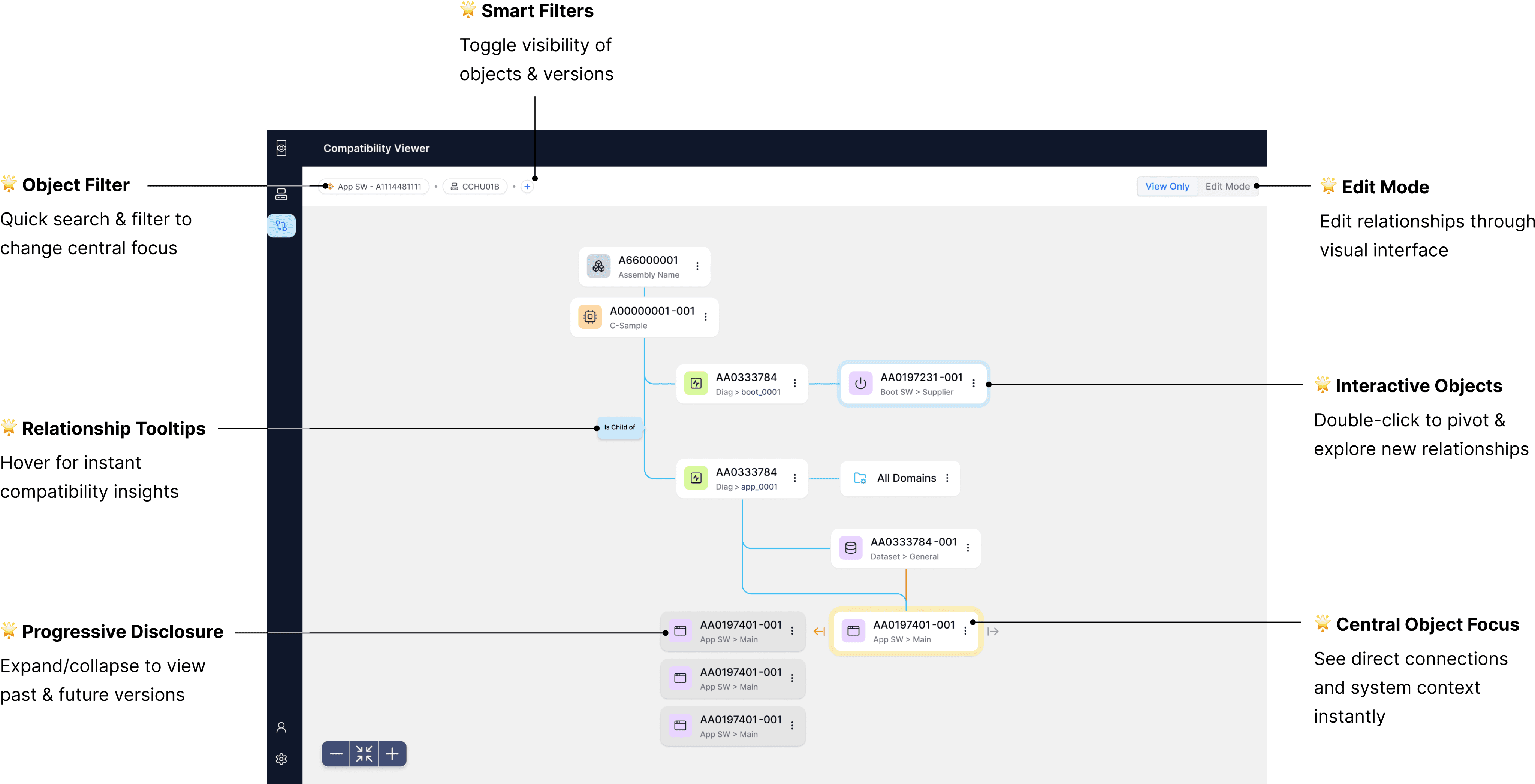
Reintroducing the Familiar: Adding a Sidesheet
Our next iteration added a customizable side sheet that displayed relationships in a familiar tabular format. Engineers could skip cryptic codes and instead customize data columns to their needs.
By pairing this familiar interface with our new object visualization, we respected existing workflows while introducing powerful capabilities—creating an intuitive solution that would drive immediate adoption without extensive training.
Key Learning: Bridging the Familiar & the New
This design challenge reinforced a principle I've found essential in complex technical interfaces: users need familiar elements when navigating new concepts.
The final solution - combining an interactive relationship tree with a customizable side sheet - struck this balance perfectly. Engineers could explore connections visually while accessing details in formats they already understood.
Usability testing confirmed this approach. Participants could quickly grasp both the new visualization and familiar data structure, reducing the time to understand relationships by 60%. This blend of new capabilities with established patterns continues to guide my approach to designing complex technical systems.
Reimagining Vehicle Software Visualization
Designing an intuitive visualization system for complex software dependencies.
About TechDex
TechDex is an initiative to help engineers tackle the growing complexity of vehicle software systems. It visualizes interconnected software relationships, centralizes scattered data, and enables quick assessment of compatibility for new features and updates.
My Role
As the product designer, I led research, ideation, prototyping, and gathered stakeholder feedback, collaborating closely with the product lead to iterate on the solution.
The Challenge
Design a solution that enables users to visualize software compatibilities and understand developmental status. The design should align with users' mental models and allow quick access to relevant information.
TLDR;
Picture this: Automotive engineers juggling multiple platforms, constantly having to context switch, just to figure out if (and how) their software works together. Sounds terrible, right? That's where I came in. After many sessions of research, analysis, feedback, and iterations, I took the chaos and translated it into a design that will help teams easily work with and quickly understand software relationships and compatibility.
Over 6 weeks, I took user pain points, stakeholder feedback, and business goals from concepts to user testing-ready designs of our new software compatibility system.
Why was this important?
Currently, engineers spend hours hopping between platforms just to figure out if software components work together. It's like trying to solve a puzzle while the pieces are scattered across different rooms – frustrating and wildly inefficient. Sometimes we're even reverse-engineering entire trucks just to understand how everything fits together. The impact? Delayed features, poor customer experience, missed innovation opportunities, and a constant stream of "this might break that" anxiety.
In order to empower our engineers to focus on innovation and creating amazing vehicle features, we needed to create a one-stop shop to understanding software compatibility.
Constraints & considerations
Limited Resources & Timeline
With an upcoming MVP launch, development resources and time were limited. We needed to focus on high-impact solutions that could be implemented and understood quickly without reinventing the wheel.
Complex User Landscape
With users spread across different teams and roles, each with varying needs and workflows, we needed to design a system that could serve everyone without overwhelming anyone. Limited access to end users meant we had to be strategic about gathering design feedback and particular about feedback insights.
Early UX Maturity
As UX research isn’t yet part of our team's standard process, I proactively sought out users and created lightweight testing methods to ensure our design decisions were backed by real user feedback, while demonstrating the value of user-centered design to the team.
defining our Problem
The Challenge: How might we help engineers visualize and understand software relationships quickly and confidently, while maintaining access to the technical depth they need?
I conducted 5 stakeholder interviews across different relevant roles to understand current workflows and pain points. The insights revealed three key areas of friction:
Research Insights
I conducted 5 stakeholder interviews across different relevant roles to understand pain points and current workflows to inform our design direction.
Insight
🧠 Existing Mental Models
Engineers already visualize software relationships in their heads – design should leverage these familiar patterns rather than create new ones.
📸 Need for Big Picture & Detailed View
Difficulty understanding how components fit together and sharing this understanding across teams slows down decision-making.
ℹ️ Varied Information Needs
Different teams need different views of the same data – design must support multiple ways to access and understand information.
Design Impact
→ Leverage Familiarity
Visualization system needs to maintain familiar hierarchical structures while introducing new relationship views.
→ Avoid Information Overload
Users need both quick overviews and detailed specifications – design should reveal complexity gradually to prevent overwhelm.
→ Role-based Personalization
Different teams need different views of the same data – design must support multiple ways to access and understand information.
Finding Visual Solutions That Work
After extensive research into visualization patterns and technical requirements, I converged on 2 potential approaches that balanced implementation effort with user needs.
- Focus on one single software hierarchy
- More closely matches current engineers' mental models
- Quick understanding of direct relationships
Option #1: Hierarchical Relationship View
- Focus on one single software hierarchy
- More closely matches current mental models
- Quick understanding of direct relationships
Option #2: Network Visualization Approach
- Shows complete relationship context
- Better for system-wide understanding
- Reveals indirect relationships
- Shows complete relationship context
- Better for system-wide understanding
- Reveals indirect relationships
Option #2: Network Visualization Approach
While the hierarchical view aligned closer to users' existing mental models, it oversimplified relationships and critically missed version control needs. The network view effectively showed the complete system context but risked overwhelming users with its complexity.
Navigating Connections Easily
Our solution uses a simple hierarchy where you can pick what matters most to you. See connections to older versions by expanding archived relationships, or explore related items by selecting different focal points. This clean navigation lets you move easily between components and discover connections without getting lost in technical details.
Reintroducing the Familiar: Adding a Sidesheet
Our next iteration added a customizable side sheet that displayed relationships in a familiar tabular format. Engineers could skip cryptic codes and instead customize data columns to their needs.
By pairing this familiar interface with our new object visualization, we respected existing workflows while introducing powerful capabilities—creating an intuitive solution that would drive immediate adoption without extensive training.
Key Learning: Bridging the Familiar & the New
This design challenge reinforced a principle I've found essential in complex technical interfaces: users need familiar elements when navigating new concepts.
The final solution - combining an interactive relationship tree with a customizable side sheet - struck this balance perfectly. Engineers could explore connections visually while accessing details in formats they already understood.
Usability testing confirmed this approach. Participants could quickly grasp both the new visualization and familiar data structure, reducing the time to understand relationships by 60%. This blend of new capabilities with established patterns continues to guide my approach to designing complex technical systems.